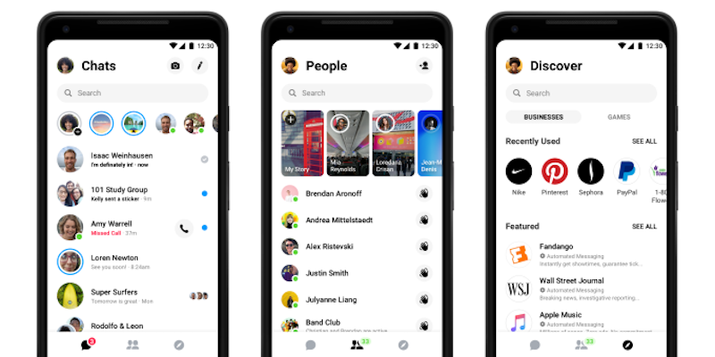
For its 1.3 billion users, Facebook Messenger 4 isn’t a drastic redesign. Users will first notice that its tabs have been pared down from nine to three.
Each tab invokes a different screen:
- Chats: the inbox where you manage your conversations with friends
- People: at the top of that screen is a carousel—now supersized
- Discover: a new way for businesses to start a conversation with Messenger users [source]
“This is a new foundation that will give us the ability to start building way faster, way better and way more powerful features,” says Facebook’s head of Messenger Stan Chudnovsky
- There are currently 10 billion messages sent between people and businesses each month.
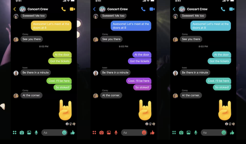
In a short statement, Chudnovsky said that the refreshed design is meant to integrate all its new features in a less complicated way, while also paving the way for new features, like the upcoming “dark mode.”
“We either continue to pile on, or we build a foundation that will allow us to build simplicity and powerful features on top of something new that goes back to its roots”, Stan Chudnovsky
Messenger was born as a simple way for Facebook users to send messages to one another while they browsed it on the desktop. It was in 2014 when Messenger has become a mobile app.
Like in many other cases, Facebook executives took notice of the outsized success that China’s WeChat had in becoming a digital wallet and identity system, and set about trying to mimic it. Mission possible!


